Virtual
Design
Spaces
Architecture B.Sc. Thesis 2018
The thesis explores the possibilities and limitations of designing virtual environments for use in a virtual design application as used by the automotive design field.
The purpose was not to build an environment as an application design or experience in itself nor is it supposed to be a manual of how-to’s for VR design. It rather explores virtual environments as new workspaces in the age of digitalization, how tools offered by game engines like Unity3D and today’s technological standards can be used to build these environments and how it benefits from architectural expertise.
VR Design
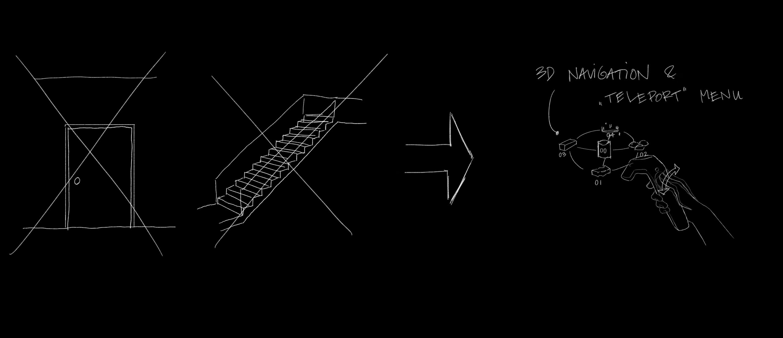
What does it mean – designing for Virtual Reality? VR is a new space, a whole new world without restrictions. You can build anything you want without having to follow any physical rules. You don’t need columns, walls, doors, stairs… But maybe you still want them. Maybe you want this space to resemble a real room so you feel safe. Maybe you need this kind of familiarity. Or maybe you want the complete opposite – something completely disparate. You’re free to decide what kind of story you want to tell, what kind of feeling you want to evoke.
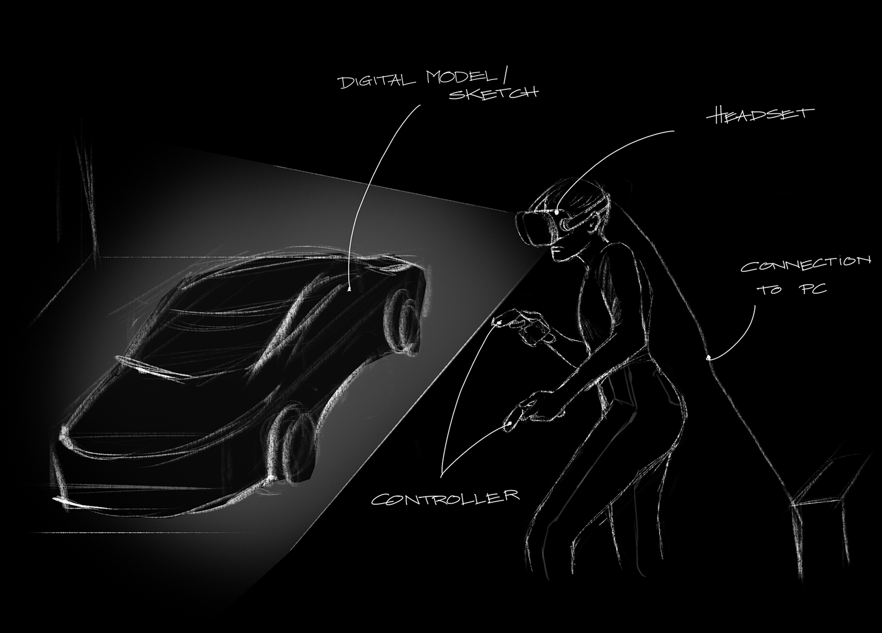
The main purpose of the environments built in the course of this thesis is to serve as creative work and design spaces inside virtual reality. Therefore it is desirable that these rooms are conducive to the design process. Thus the main design aspect should be that they support designers in their work and help find focus without distracting.
With the luxury of apparent endlessness, VR rooms do not need to serve multiple purposes in order to allow for a maximum of flexibility. That's why these virtual environments are designed with specific tasks or users in mind.
Following are some aspects that were considered for the design of the virtual spaces created for this thesis.
Architects & VR
With more and more applications being available in VR, the workspace is often shifted into the virtual world. It‘s no longer the desk and chair one is working with. But what is it then? Architects are designing office buildings where people spend a lot of time for work. Why shouldn‘t architects be the ones to design the virtual workspaces as well?
VR offers the possibilty to not just give the user the ability to work on and view their designs digitally in 3d but to experience them and the process firsthand.
By constructing a virtual world the user is transferred to a different place. It is the goal to make them feel comfortable in order for them to want to use the tool for a longer period of time. Similar to how people decorate their work desks in order to feel more comfortable.
When combining a variety of different functionalities it is similar to combining different rooms in a building. Without building some kind of interconnectivity and navigation between the functionalities the user will feel disrupted in their workflow. So it makes sense to create a navigation similar to the structure of a building - as one would move from one room to another - but with new kinds of navigation. This is also important for a feeling of immersion.
Style & design thoughts
The main goal was to not blindly copy what‘s already there or trying to imitate the real world. Because with today‘s technical standards that‘s not 100% possible - considering all human senses. Instead the focus was on building something that‘s new and exciting with the given possibilities and simultaneously delivering the needed tools.
Because even though the virtual environments are meant to be work spaces and aides in the design process, there is of course the aspiration to design an experience and establish some kind of atmosphere.
In order to achieve that uncommon light sources or unusual geometric forms can be used. To give the user some sense of otherworldly experience. Moving objects are also a key component. In reality architecture are usually static. But in VR and with game technology it is possible to animate things that aren‘t connected to anything. Objects can move freely around space - on their own will, randomly or by being triggered. Objects don‘t have to adhere to the laws of gravity.
This may seem trivial, but it‘s those details that play an important role. Details and the implementation of ambient sound can help sell a virtual environment and make it believable.
It is better to focus on big shapes and use low-frequency visual details in order to avoid aliasing. Aliasing is visible as jagged edges on geometry and is especially obvious in VR environments because of the constant movement of the camera.
Visual details can and should be used to establish a sense of scale, though. Especially when designing environments that are completely virtual and unknown to the user, details can help with orientation.
Possibilities & design aspects
In reality architecture design is usually bound to certain rules, restrictions and borders. Such as plot boundaries, climate, physics or national regulations.
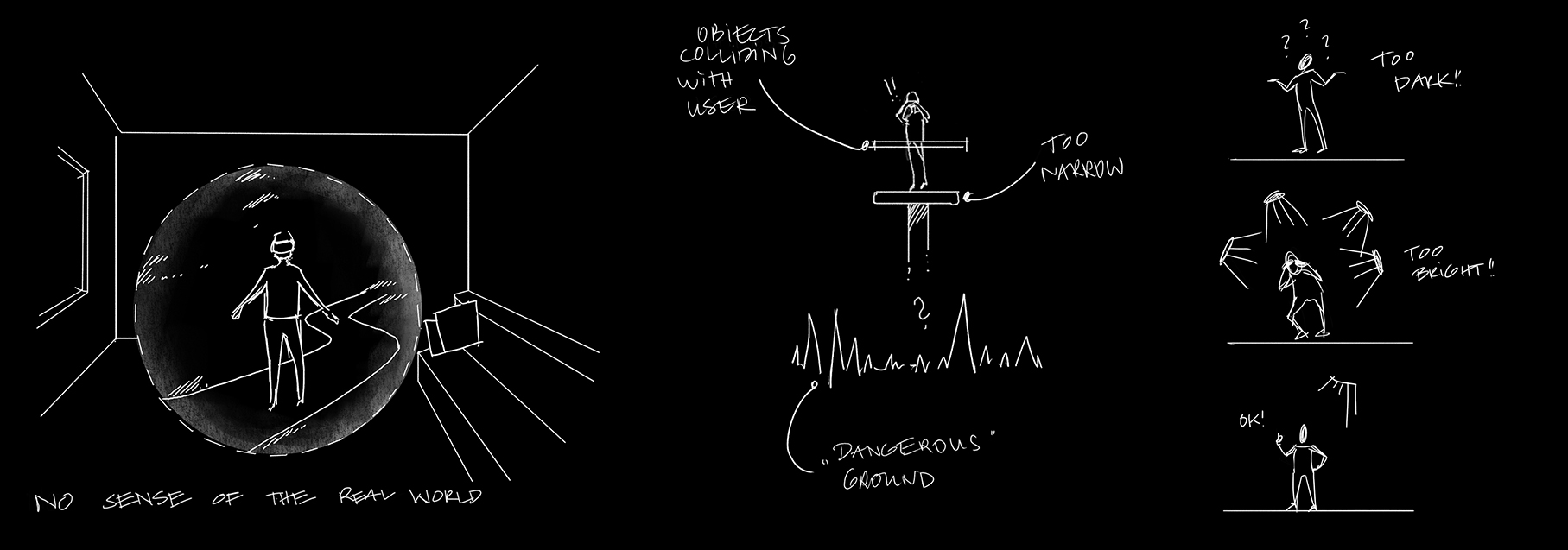
In virtual reality these don‘t apply, of course. But there are other aspects one has to keep in mind when designing for VR. Some of these are connected to the hardware being used and optimizing the performance of the 3d environment to ensure a smooth experience. Others are connected to the design and effects - like moving objects, simulating heights or the position of the user.
But even though there seems to be a lot of restrictions, there‘s also a whole lot of possibilites. There‘s a whole design palette of functionalites one can use when designing a virtual world inside a game engine.
What Game Engines offer
<geometry> Creating or importing geometry in form of 3d objects is the most obvious thing you can do to create virtual worlds. You could also use 3d scanning and photogrammetry to import real world environments.
<sound> You can add ambient sound to increase user‘s presence and the environment‘s believability.
<lighting> The lighting can be modified to one‘s need in almost every possible way imaginable. Bright or dim, Realistic or surreal. It is possible to use real world lighting information in form of HDR photography.
<animation> Objects can be animated in order for them to move around. This can be anything from organic floating forms or moving walls to using triggers in order to make objects move on specific occasions.
<postfx> The camera that is attached to the headset can be modified with post effects to make the image more believable. These effects are an important factor for creating atmospheric imagery for VR. Possible effects include Ambient Occlusion, Color Grading, Vignetting and others. Not all of the effects will work with VR - for example motion blur or lens distortion.
<interaction> Another great advantage is the possibility of adding objects that can be interacted with. For example for navigation, environment manipulation or triggering special events.
<lighting> This is by far the most powerful and therefore most important aspect of designing virtual spaces. Lighting affects how a scene is perceived and which mood is conveyed to the user. In a design environment this is a powerful tool since it gives the user the possibility to put themselves in a mood they seem fit for what they are going to work on.
My first assumption was that a very evenly distributed light would be desired. This is indeed suited if you’re showcasing and looking at your work from a very technical viewpoint. But in VR this makes it hard to distinguish shapes and it promotes a very clean atmosphere – similar to an exhibition space. It doesn’t offer a lot of character. Especially if you want to your design to convey a specific feeling. Thus a set of various lighting scenarios is desirable.
In game development and graphics there is a term called IBL – Image Based Lighting. This makes it possible to reproduce lighting conditions from real world situations, e.g. a striking sun in the desert or a dark cloudy day in the middle a big city. It’s especially suited for outdoor scenes/lighting. For indoor lighting it’s better to use digital lights unless you have an IBL of the specific space you’re building in VR.
Immersion & Uncanny Valley
Most of the architecture and surroundings portrayed in the environments would be called „unrealistic“. This is done purposely because of two reasons. First in order to appeal to the characteristics of „virtual reality“ and what one might link with it. Secondly to avoid the so called „uncanny valley“, a term coined by Masahiro Mori in 1970. Originally describing the phenomenon in robotics when robots have humanoid traits but not enough to be fully human and too many to be considered a toy. In this valley they feel „creepy“ and not likeable. This can be applied to various things. And in order to avoid this valley of non-affinity it is better to design environments which do not try to imitate reality 100% but also don‘t feel completely unfamiliar.
Because each room serves some kind of purpose and is most of the times related to a task that is normally done in reality, I tried to avoid copying the surrounding that one is used to in order avoid the uncanny valley. Because of today‘s technical standards it wouldn‘t be possible to represent reality completely realistically.
Thresholds & user guidance
Just like in traditional architecture design, thresholds play an important role in designing for VR. Putting the user in a seemingly closed-off environment without any visible opening may make the player uncomfortable just like being confined in reality.
Suggesting the existence of more room is advisable. This doesn’t necessarily have to be a traditional door or window. Inspiration can be drawn from game design. The game industry has been designing virtual environments with guiding players through the help of light and audio for years. Games usually consist of several levels – sometimes rooms, buildings, cities or even worlds. So the question of how to lead the player is essential and not unlike to how a person is being led through a building.
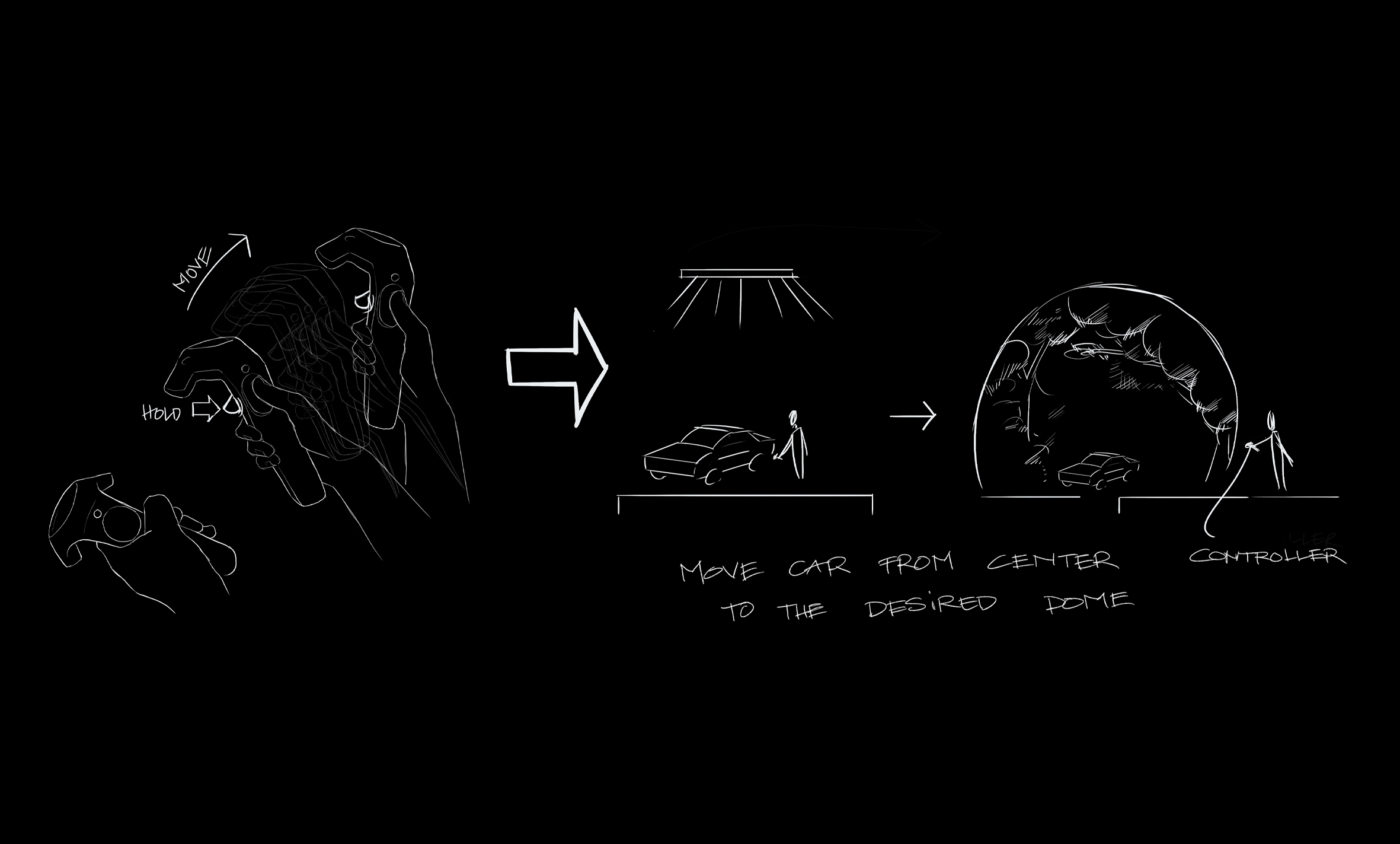
In VR spaces these thresholds serve the purpose of enabling the user to switch between the different spaces. Just like entering different rooms of a building. In a traditional application you would open the menu and click or touch the room/tool you want to use. For functionalities and navigation it’s mostly better to use 3d objects which can be interacted with. This not only supports immersion but 2D Interfaces and text are also hard to read because of hardware restrictions.
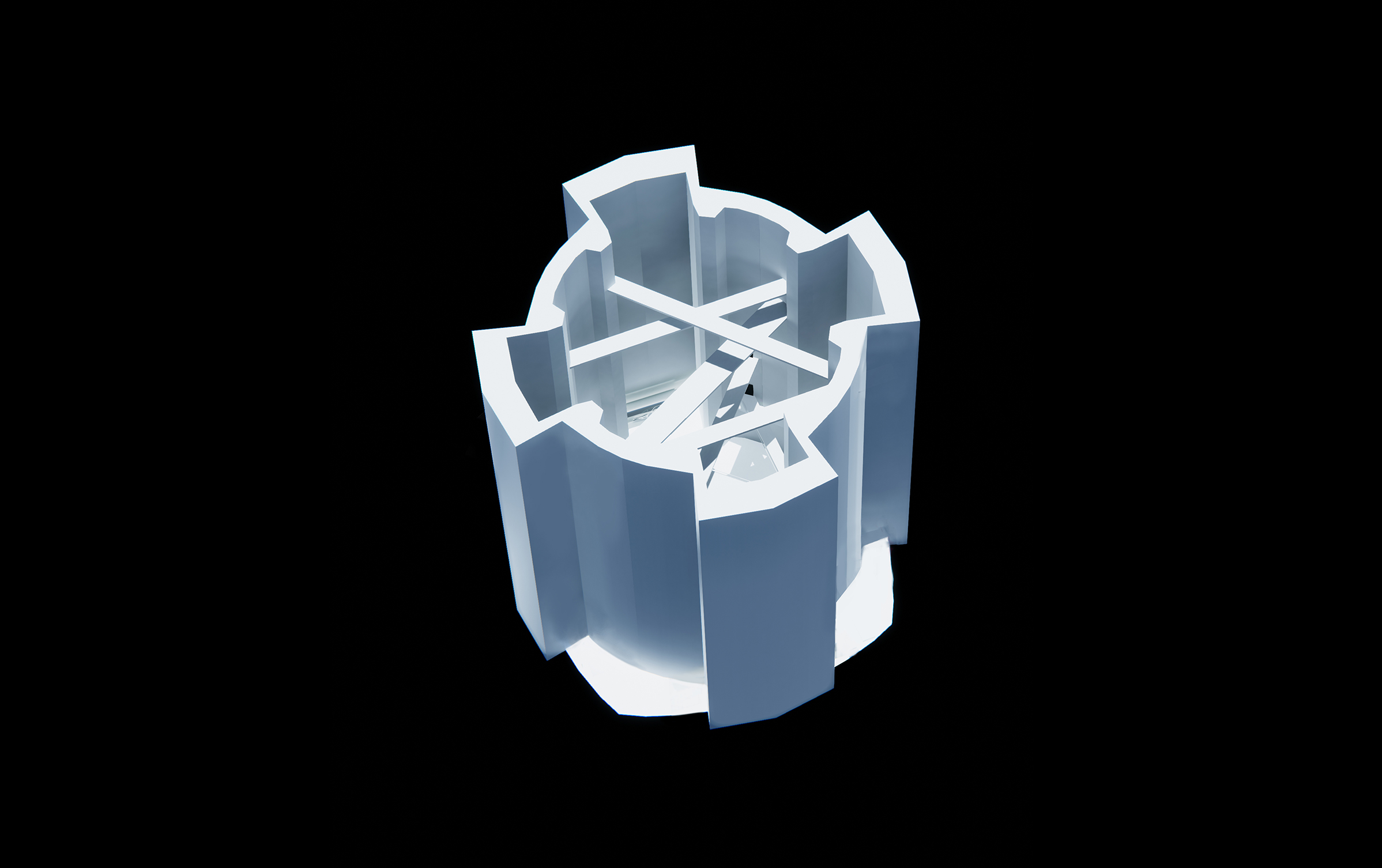
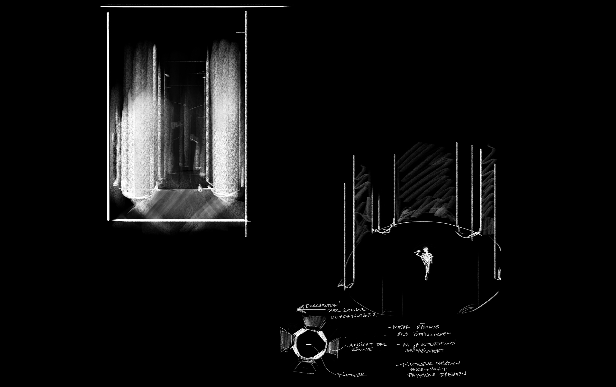
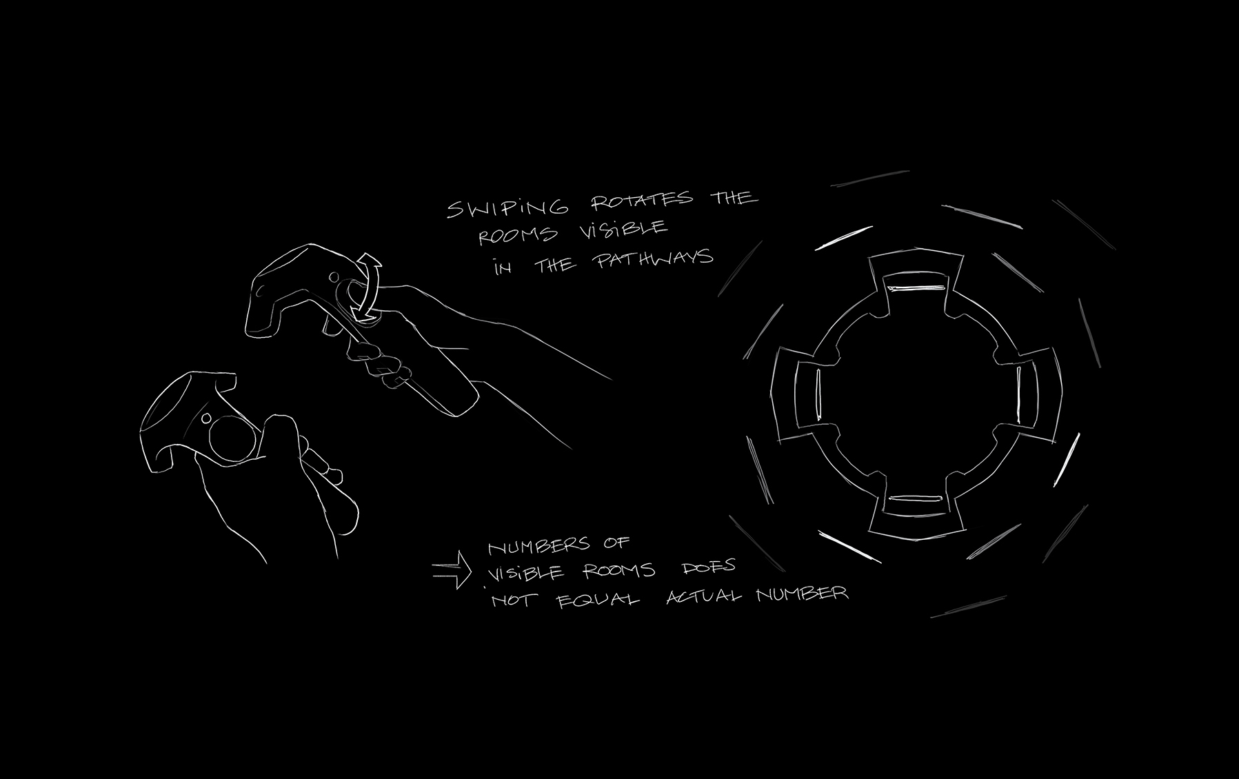
Lobby
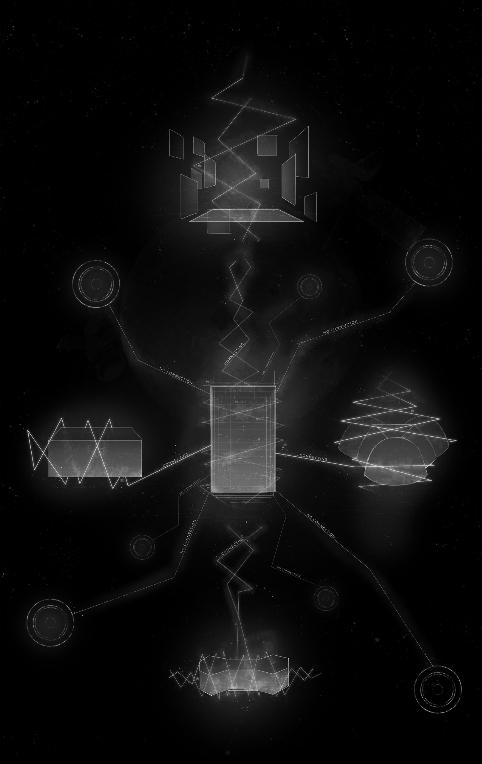
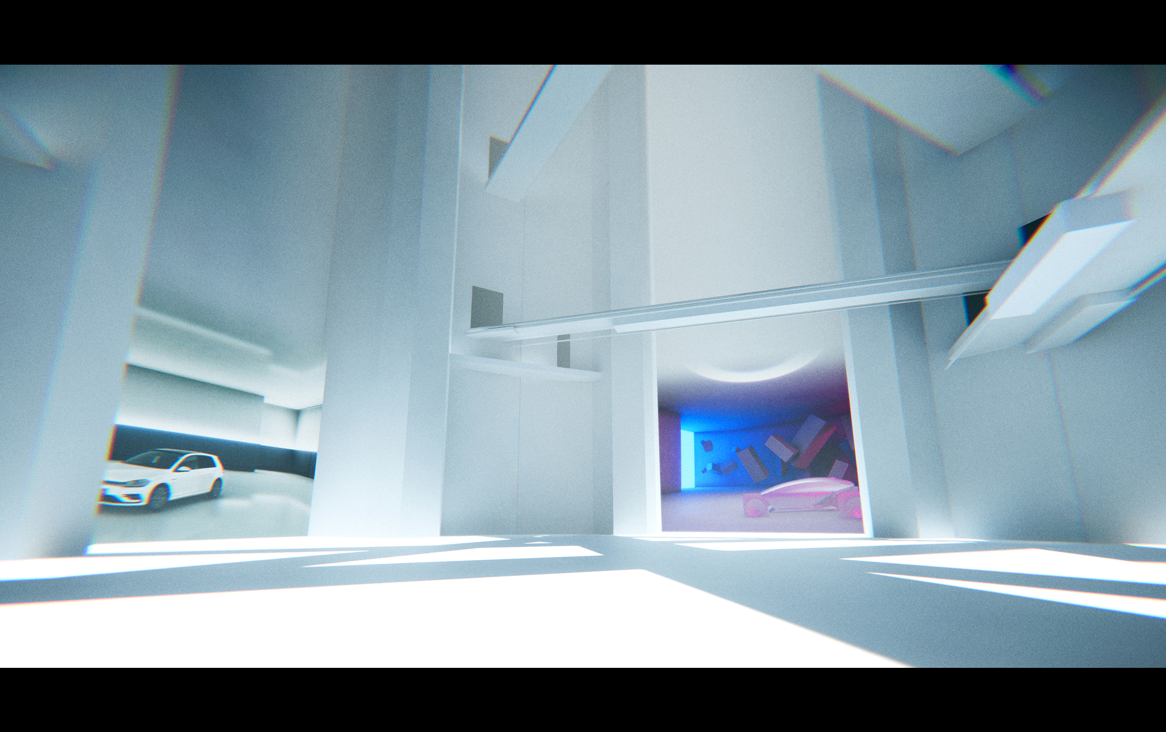
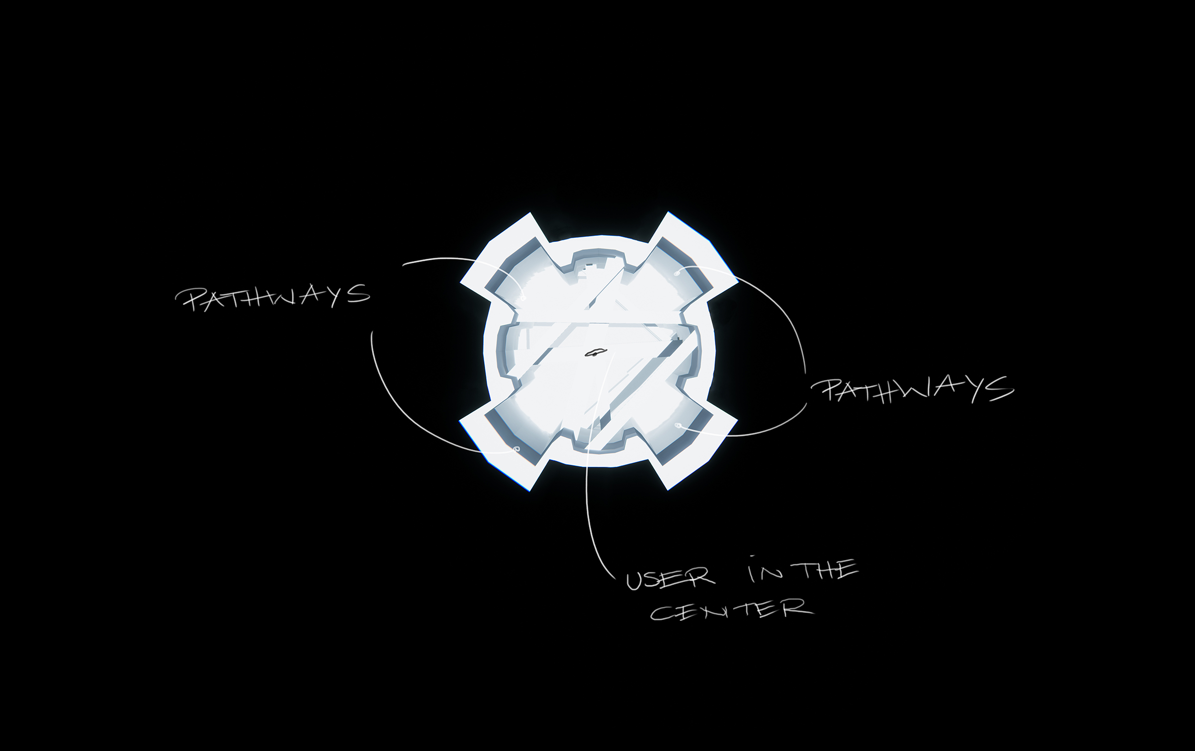
Similar to the real world, the user of the application first arrives in a virtual entrance hall that allows them to choose the space they want to use. Skeuomorphic elements like simplified arcades make it easier for them to understand the purpose of the room.
They can only see 4 pathways at first. But by using the controller it is possible to switch the displayed spaces and access more. Because of that the amount of available spaces is not limited by geometry.
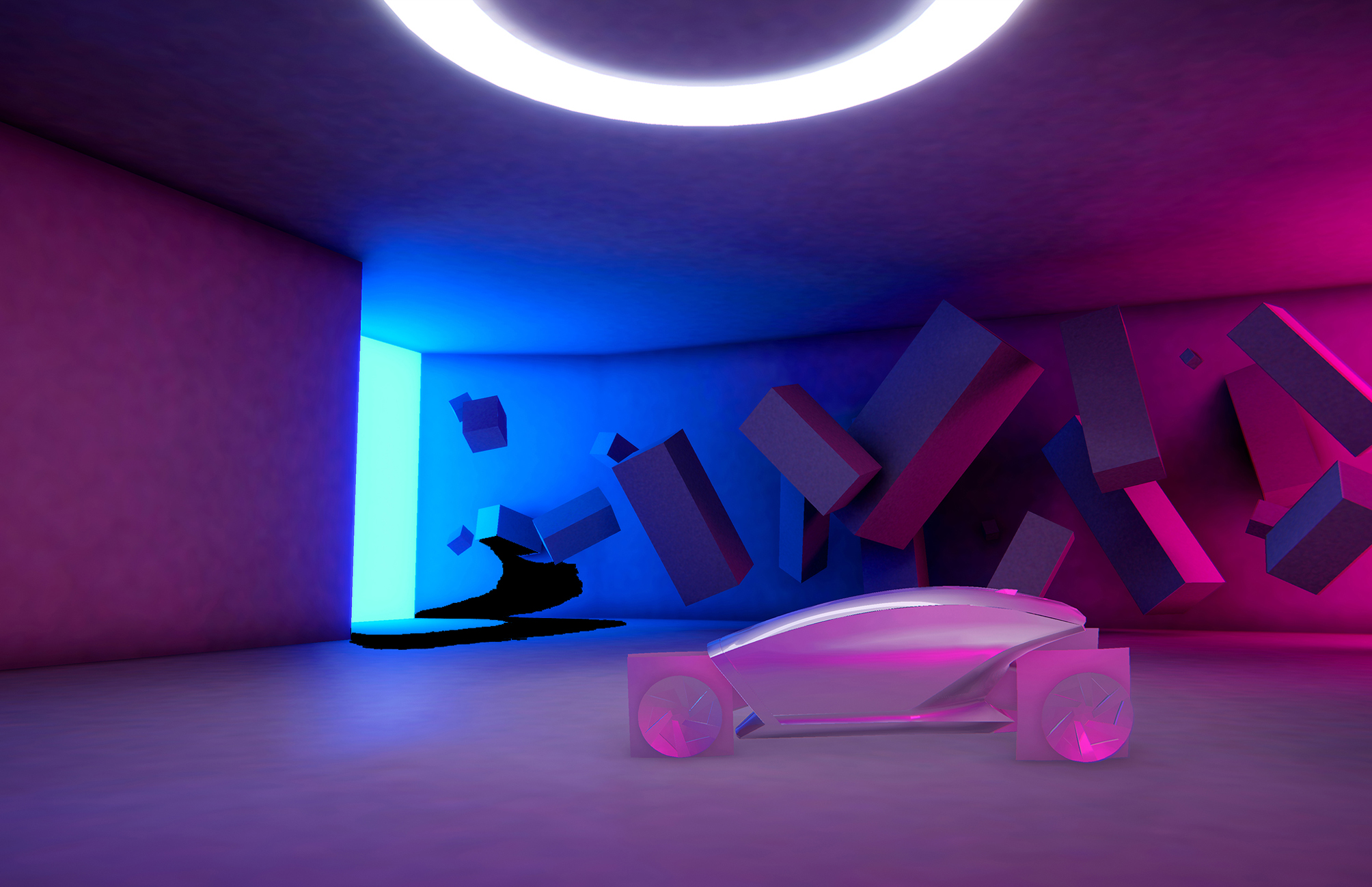
Sketch Space
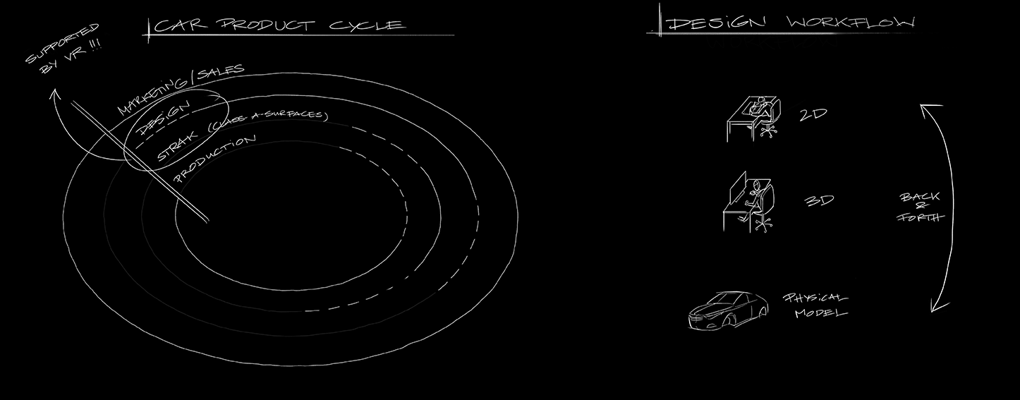
In the beginning of the design stage of a new car there is just a brief. And everything usually starts with a person doing sketches and drawings. Which they then usually hand off to modelers - 3d and/or clay. And after time, after back and forth, a first conceptual prototype arises. This room's design is based on these first sketches and drawings. They are often very atmospheric and consist of just a few lines and surfaces rendered in bright colors to evoke a certain emotion.
Biodomes
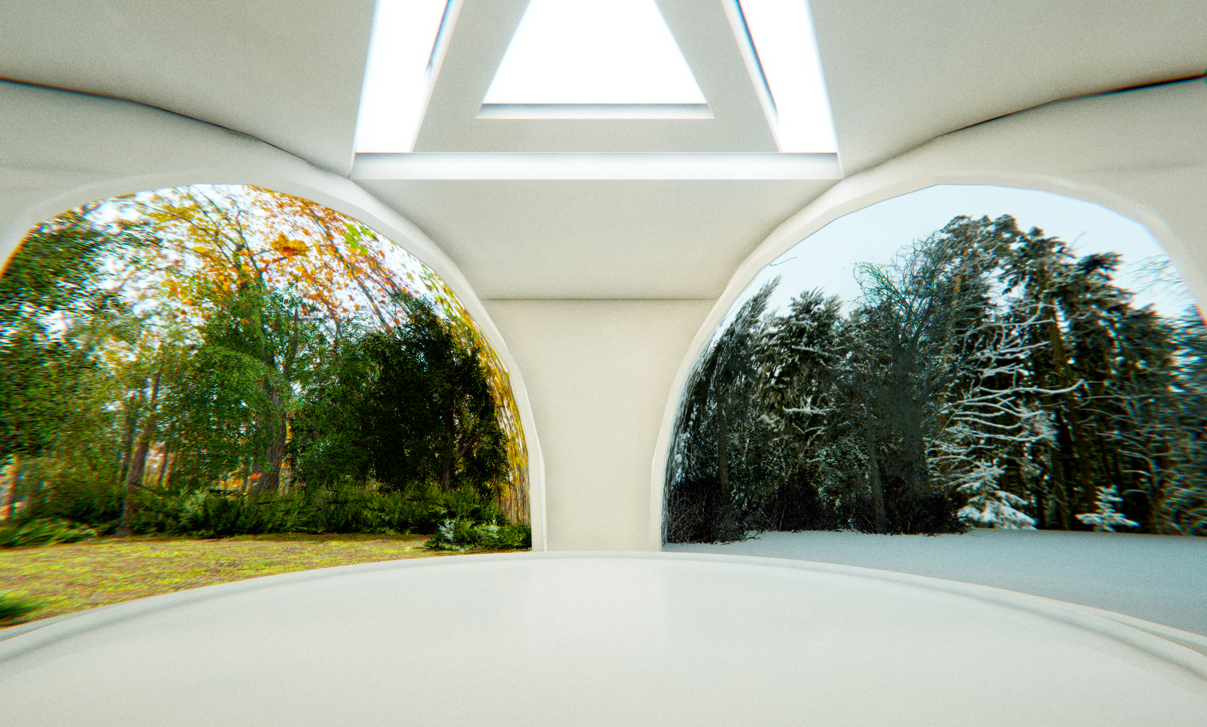
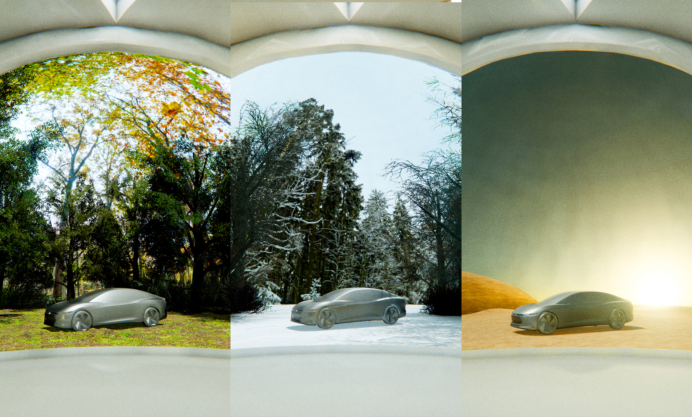
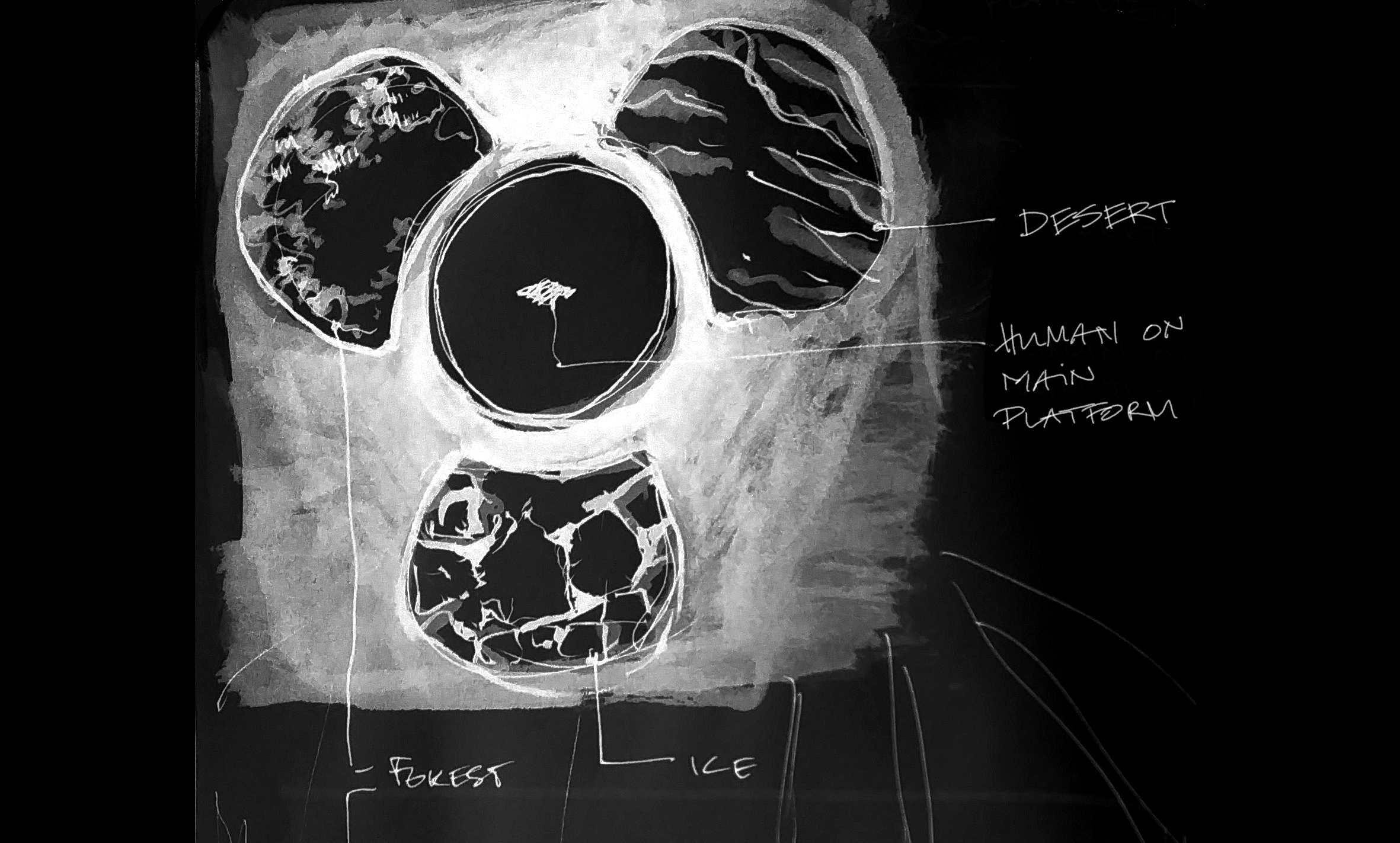
As soon as the car design progresses into a more realistic model, designers and decision makers want to see it in different scenarios and environments. Ususally this is done by producing physical prototypes that are brought to specific places and presented there. Through Virtual Reality one can now view a design in different settings very early on.
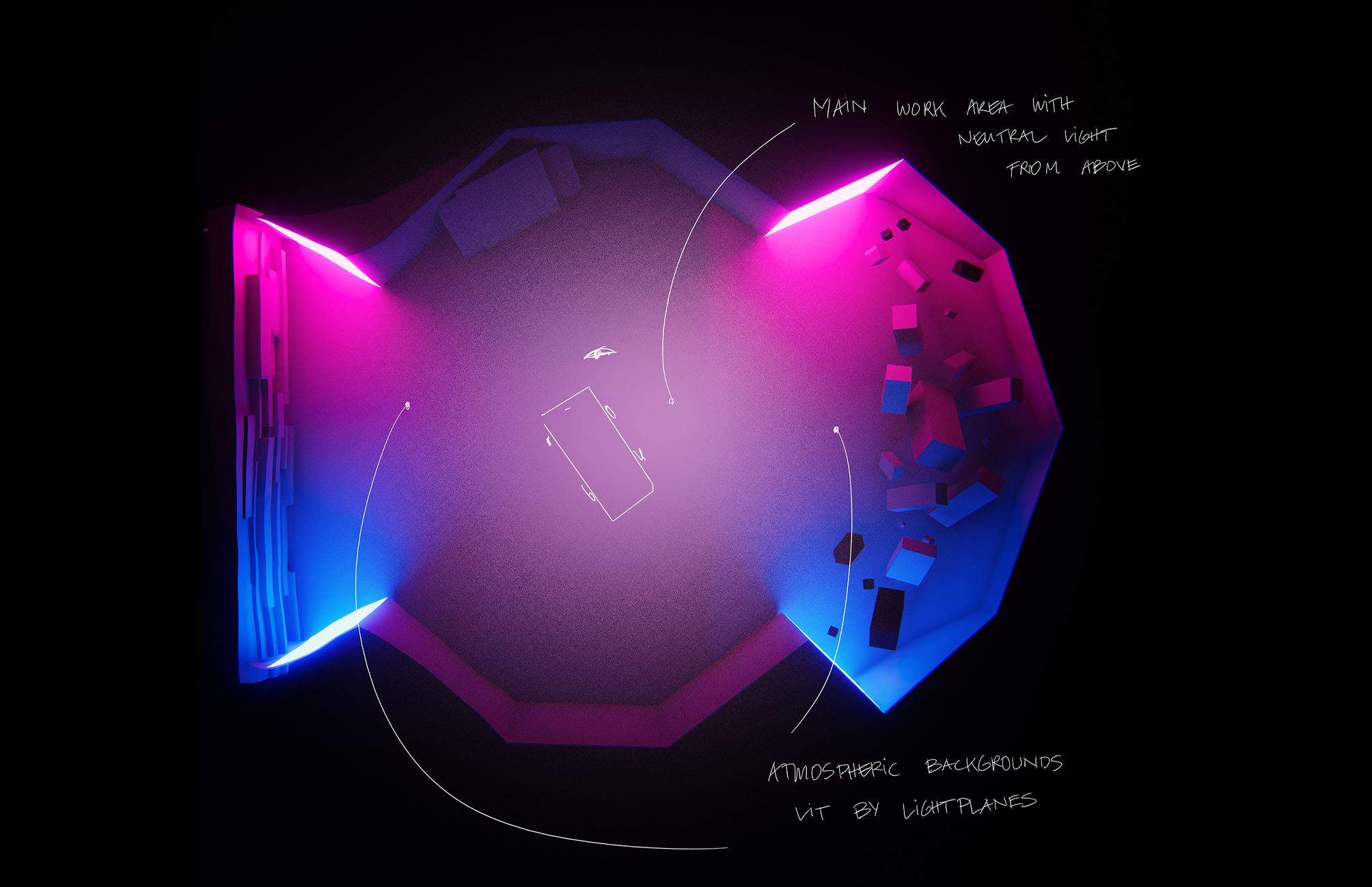
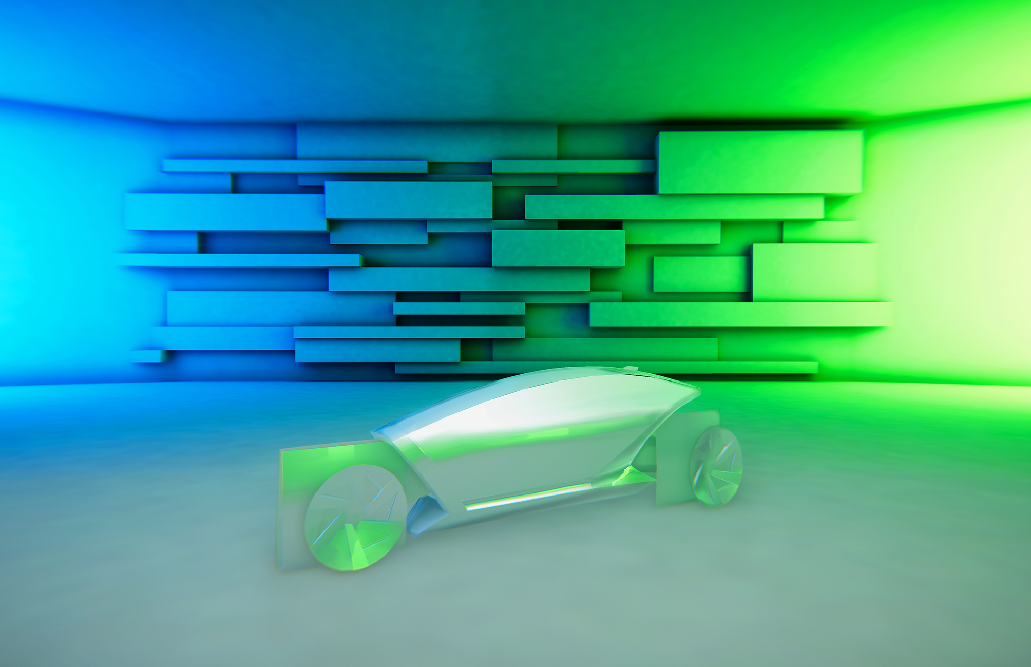
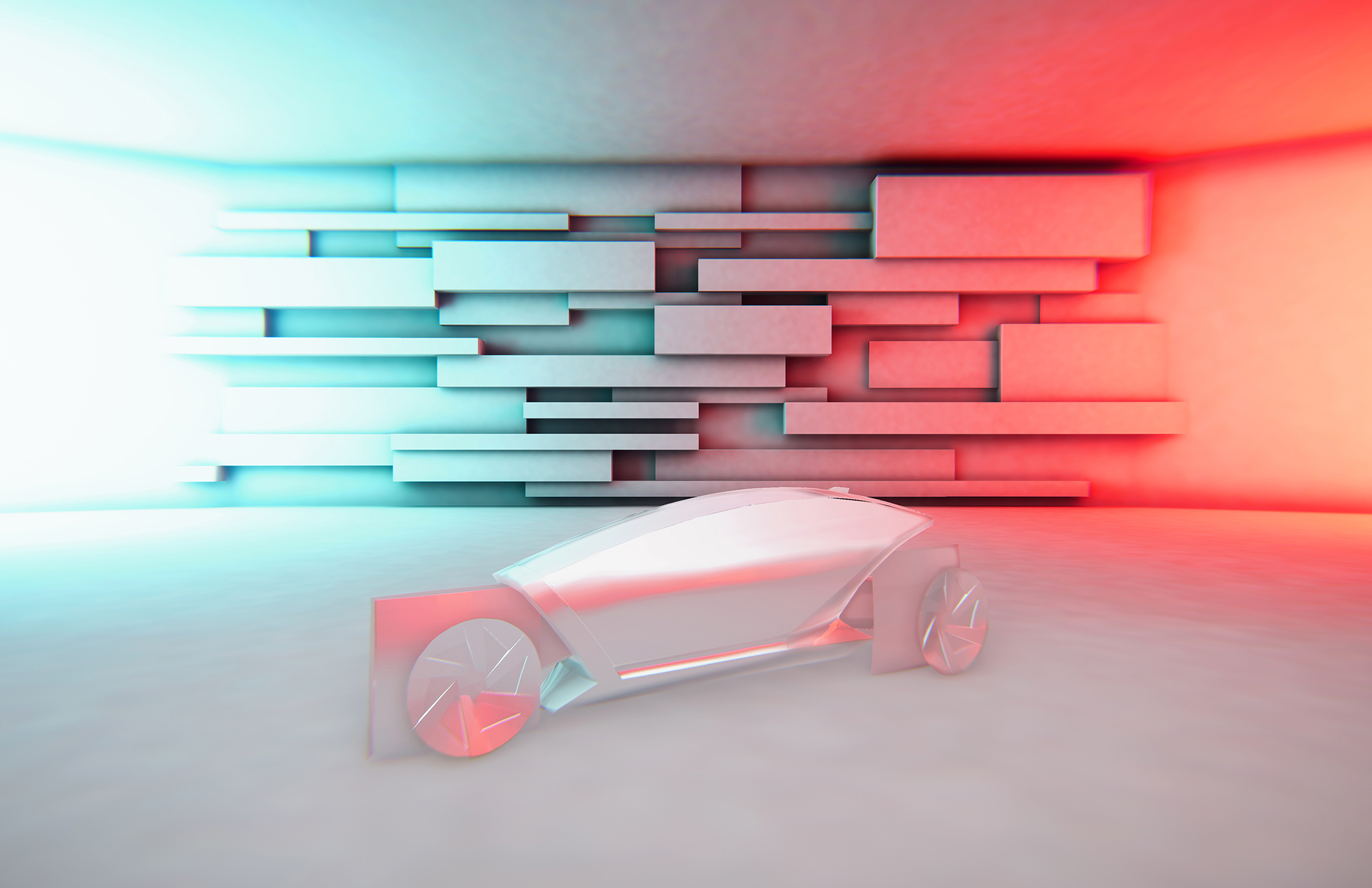
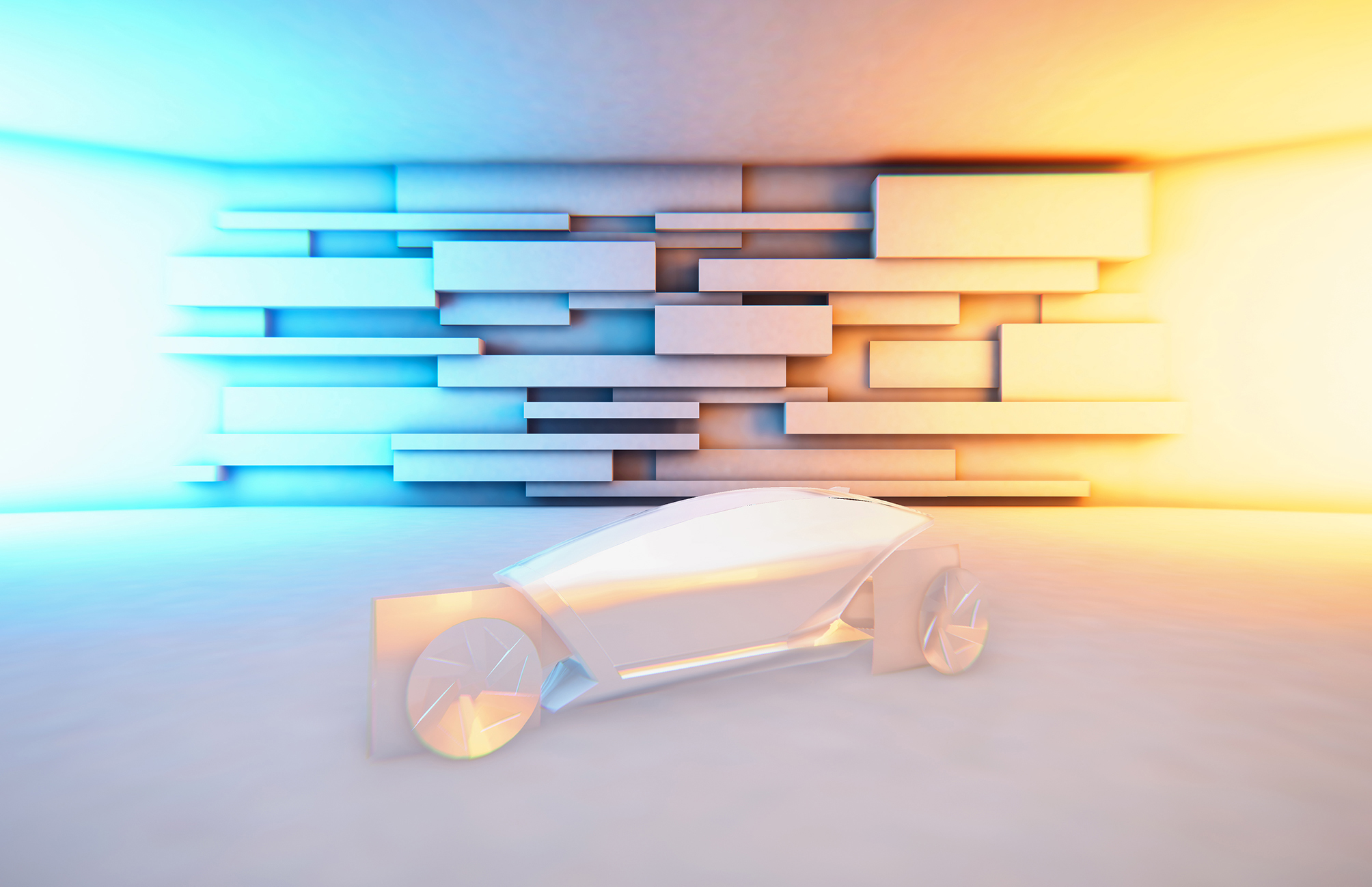
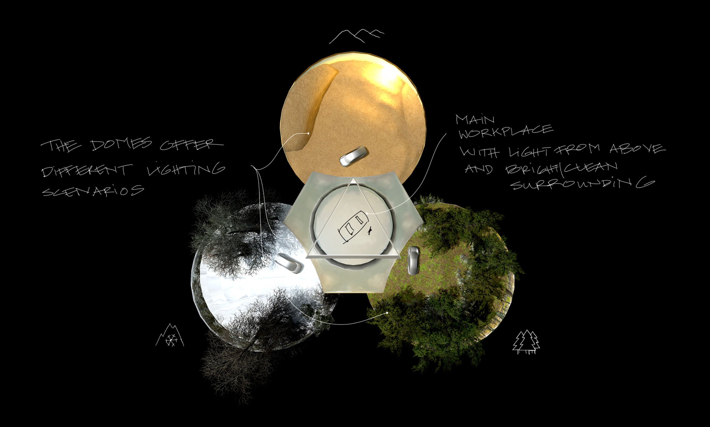
This space offers a neutral workspace while also giving the user the ability to put the car in one of three different dome-like environments. Thus gaining a better impression of the design from different angles.
By using different HDRIs in combination with technology offered by game engines, it is possible to view the design in different lighting situations in each dome.
Showroom
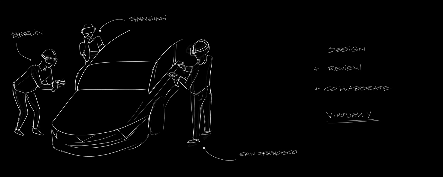
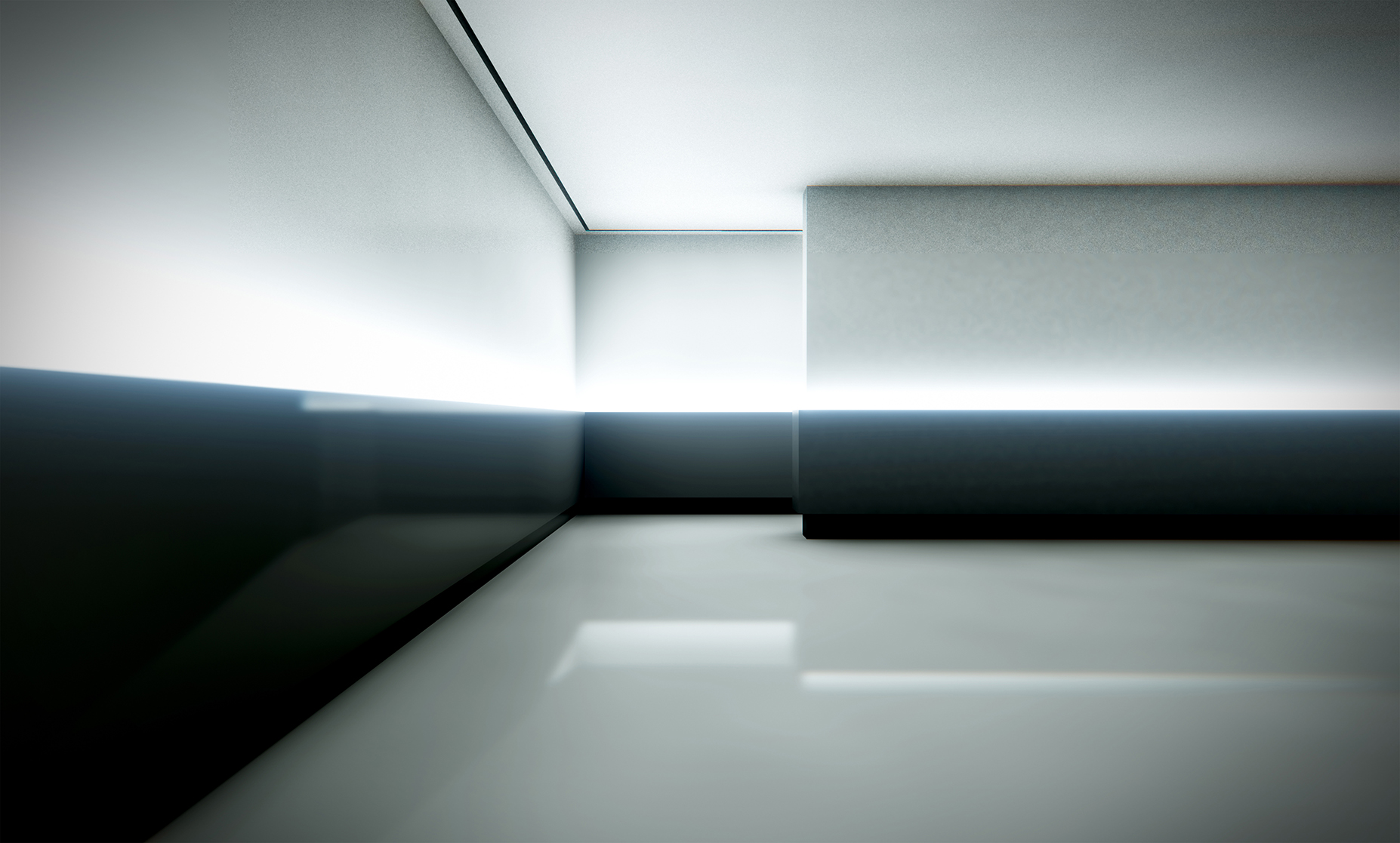
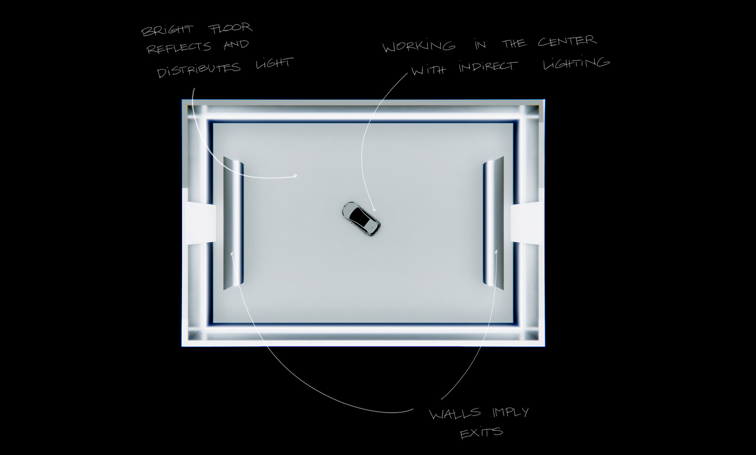
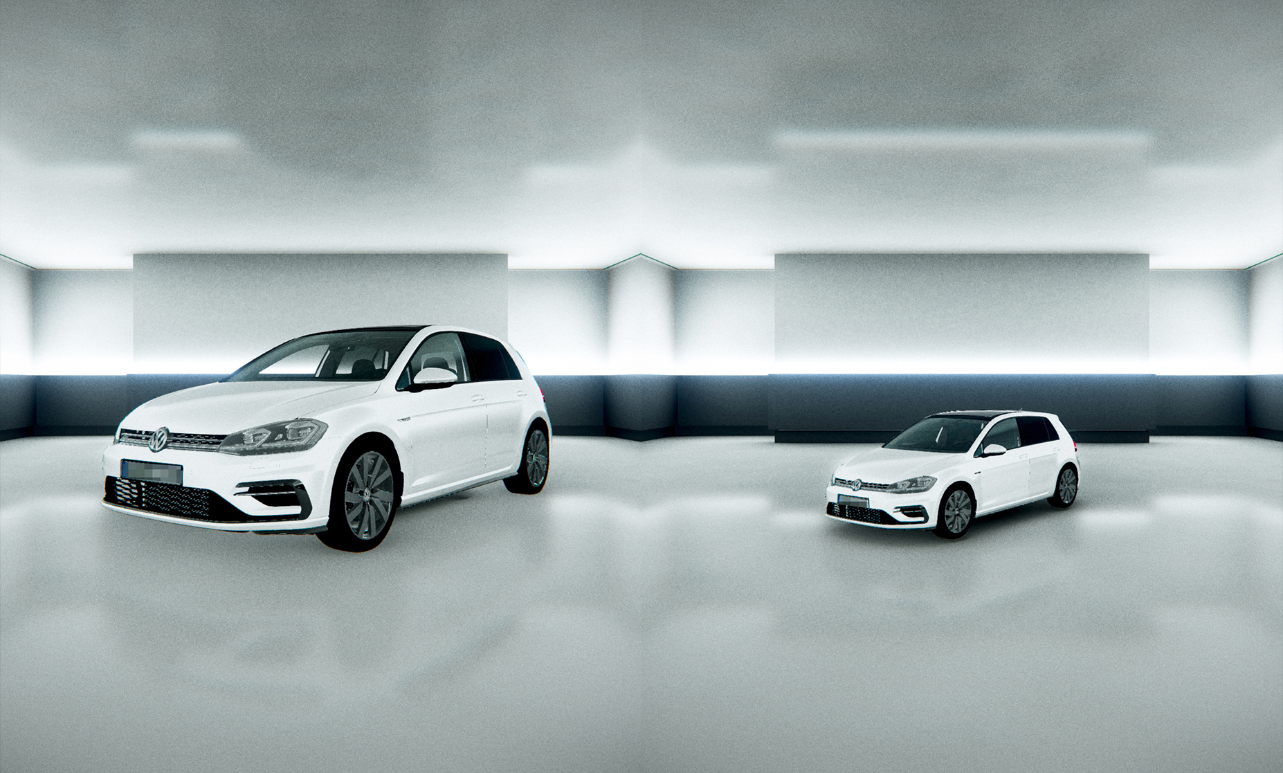
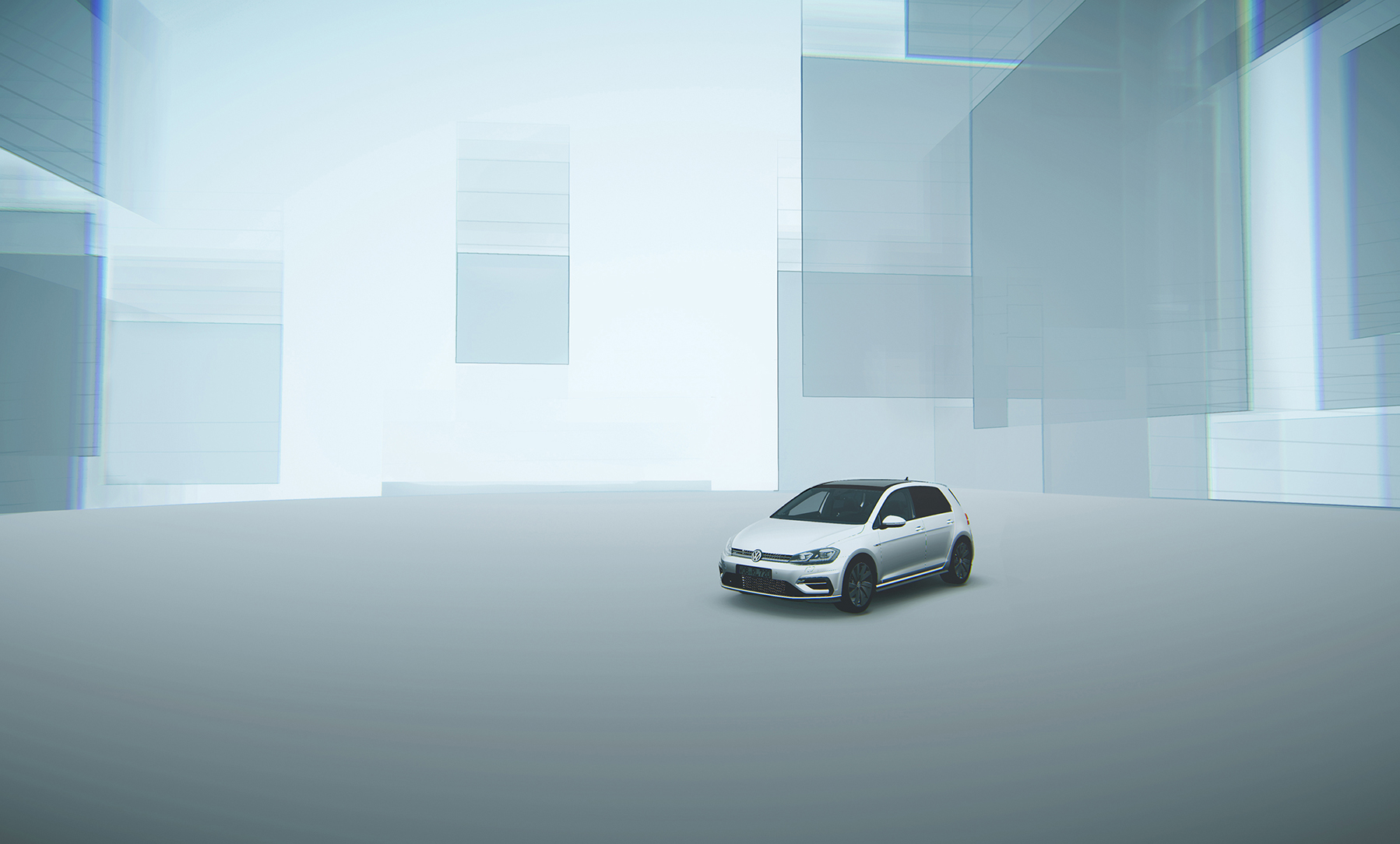
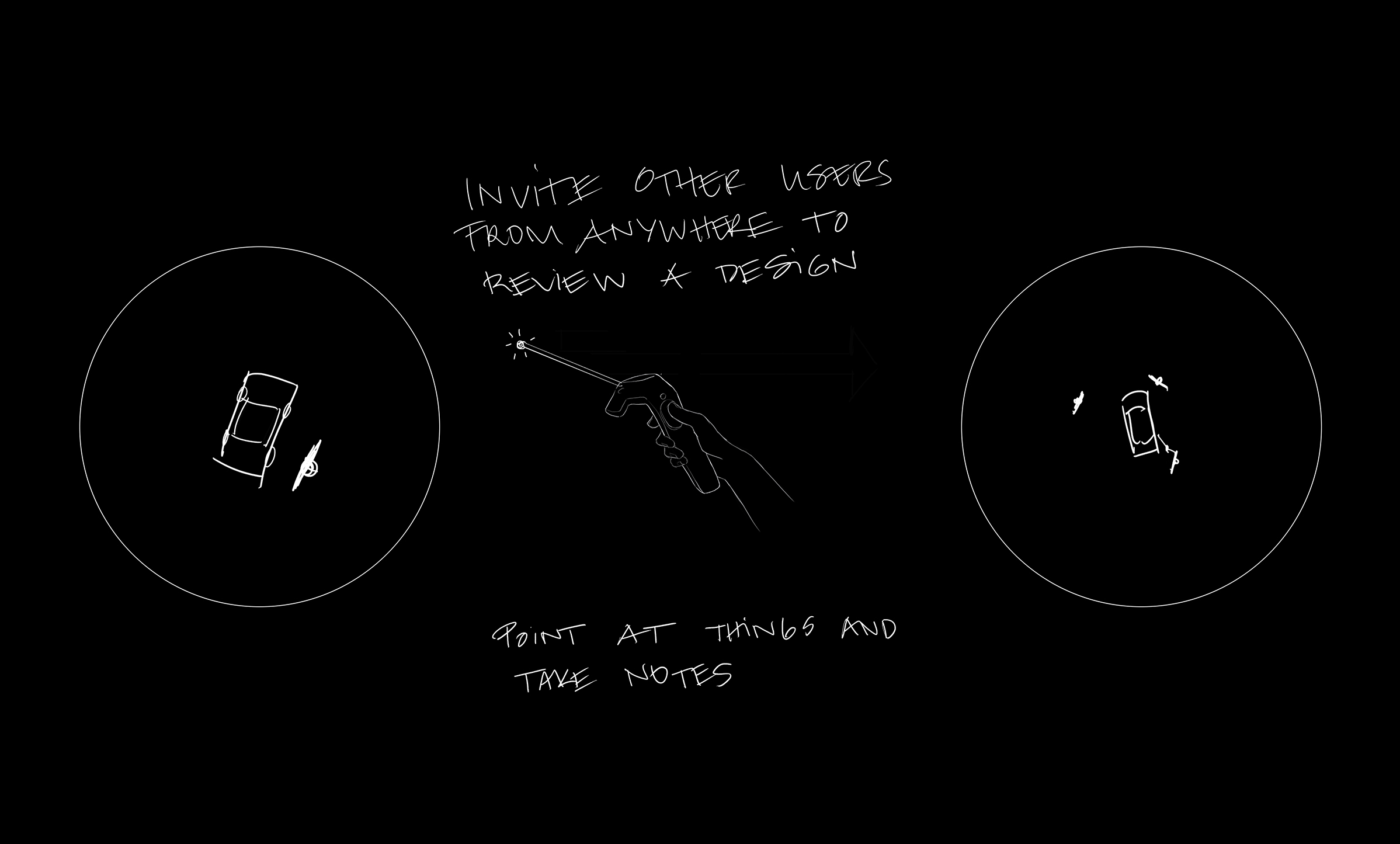
Design reviews, where designers and engineers present car prototypes to upper management, often take place in familiar spaces with a very specific lighting. This often depends on the person in charge and their preference. In this case, an indirect lighting that doesn't produce harsh reflections or shadows is desired in order to be able to evaluate the car's surfaces. The design is based on a similar place from reality so people don't have to readjust.
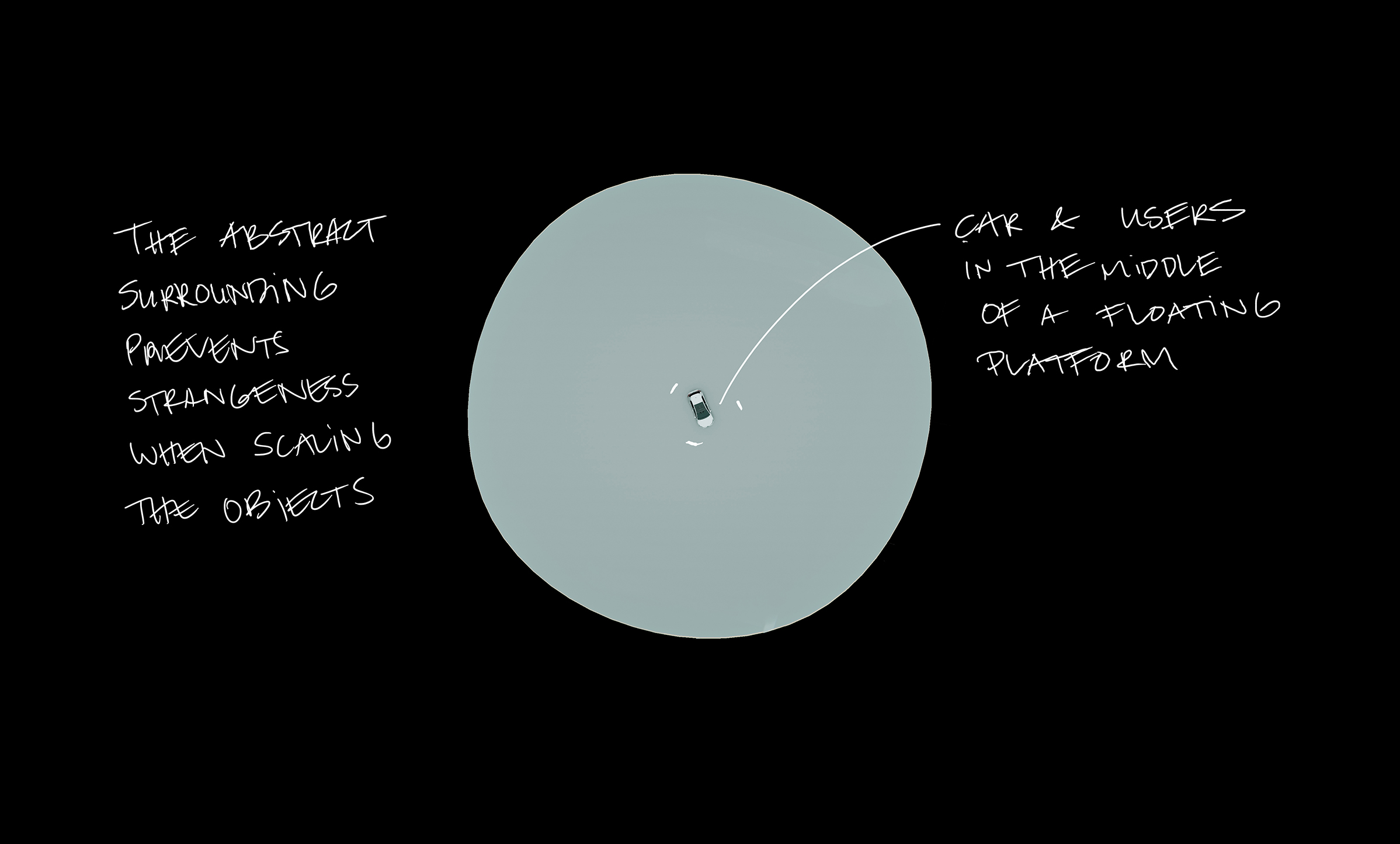
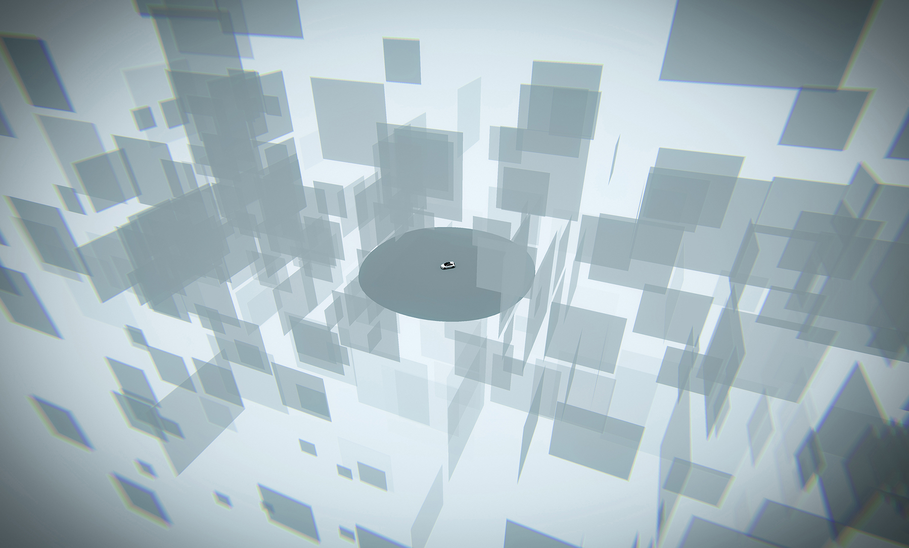
When scaling the model, the perception of the room changes. That's why it's important to use real-scale objects when designing VR spaces in order to avoid strange feelings.
Prototype
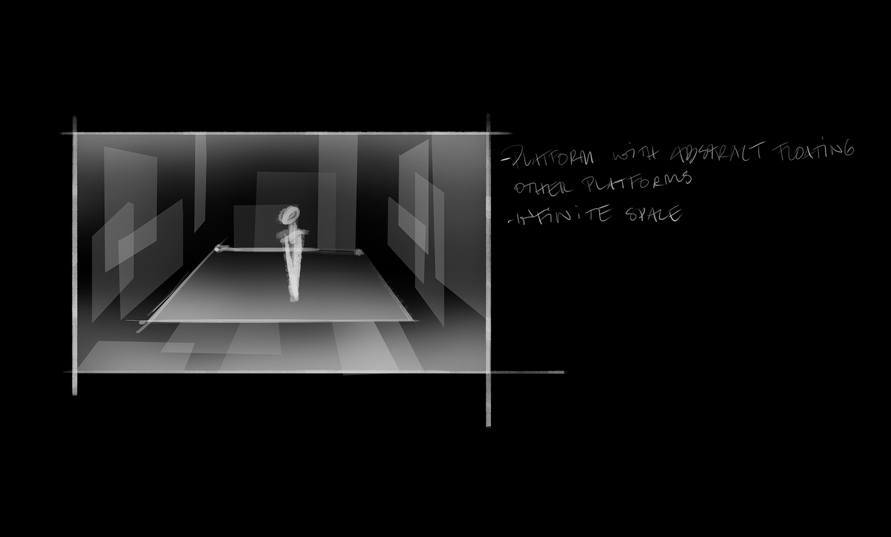
This room explores the possibilities offered by game engines and virtual reality: endless rooms without apparent borders and moving objects such as planes.
References and further reading:
Anderson, S. You’re the center of the universe: A UX guide to designing virtual reality experiences. [online] Available at: https://www.dtelepathy.com/blog/philosophy/ux-guide-designing-virtual-reality-experiences [Accessed 2 Jul. 2018].
Bridges, A., Charitos, D. (1997). On architectural design in virtual environments. Design Studies, 18(2), pp. 143-154.
Martín, N. (2016). VR Architecture: Why the Next Design Frontier Will Be in Virtual Spaces. [online] ArchDaily. Available at: https://www.archdaily.com/781391/vr-architecture-why-the-next-design-frontier-will-be-in-virtual-spaces/ [Accessed 02 Jul. 2018].
Mori, M. (1970). The Uncanny Valley. Energy, (7), pp. 33-35.
Ravasz., J. (2016). Design Practices in Virtual Reality. [online] UX Collective. Available at: https://uxdesign.cc/design-practices-in-virtual-reality-f900f5935826 [Accessed 02 Jul. 2018]
Schnabel, M. A. (2011). The Immersive Virtual Environment Design Studio. In: Wang, X., Jen-Hung Tsai, J. Collaborative Design in Virtual Environments. Netherlands: Springer, pp.177-191.
Sundstrom, M. (2015). How to design for Virtual Reality. [online] WIRED. Available at: https://www.wired.com/2015/04/how-to-design-for-virtual-reality/ [Accessed 02 Jul. 2018].